
Interactive graph-based visualization of genome architecture comparisons
Tijs van Lieshout
Bachelor internship Bioinformatics
8-2-2019
Supervisors: Franklin L. de Nóbrega, Alex N. Salazar, Thomas Abeel, Stan J.J. Brouns, Ruben Piek
Kavli Institute of Nanoscience, TU Delft – Brouns lab
HAN University of Applied Sciences
Abstract
The variability between genome architectures, the collection of non-random arrangements of functional elements within a genome, can be used to determine the similarities and differences in a genome comparison to study genome evolution. Long-read sequencing brings the benefit of a more accurate assembly in regions of the genome with repetitive sequences and complex structural variation. Long-reads can be more easily aligned to each other which leads to more accurate comparisons of genome architectures. Instead of aligning sequences, a single graph-based data structure can offer more information of similarities and differences in genome architecture in variable regions. Ptolemy is a tool that is able to compare genome architectures without the need of a reference in a gene graph with vertices representing genes. The interpretation of these gene graphs can however be difficult without visualization, and currently few tools provide biological depth when representing these graphs. In this study we present Directed Acyclic Graphs for GEnomic readability (DAGGER), a tool with a graphical user interface for the interactive visualization of gene graphs from GFA1-formatted files. We show the features of DAGGER by visualizing the genome architecture comparison of three novel Escherichia phages (most closely related to vB_EcoM_AYO145A) in a single gene graph using Ptolemy. We also present the stand-alone tool POET (Ptolemy Output Enhancement Tool). This tool can be used for the further analysis of genome graph data generated by Ptolemy. With help of Ptolemy and POET we partially analyse the genome architecture of a dataset of long-sequencing reads of a chimeric generated bacteriophage of E. coli bacteria BL21phi10. Finally, we present a discussion about the advantages and disadvantages of different layout algorithms to visualize gene graphs.
Contents
- Abstract
- List of abbreviations
- Introduction
- The benefits of long-read sequencing for comparative genomics
- The use of gene graphs for comparative genomics
- Visualizing gene graphs
- Project aim
- Methods
- Development of DAGGER
- Sugiyama Layout
- Circular Layout
- Development of POET
- Three novel coliphage dataset
- BL21phi10 chimeric phage dataset
- Development of DAGGER
- Results
- DAGGER: Visualization of graph-based genome architecture comparisons
- POET: Long-read gene graph analysis
- Analysis of the three novel coliphage dataset
- Analysis of the BL21phi10 chimeric phage datase
- Discussion
- Conclusion
- Acknowledgements
- References
List of abbreviations
BANDAGE a Bioinformatics Application for Navigating De novo Assembly Graphs Easily
DAGGER Directed Acyclic Graphs for GEnomic Readability
GFA1 Graphical Fragment Assembly format 1
JUNG Java Universal Network/Graph framework
POET Ptolemy Output Enhancement Tool
1 Introduction
The first sequencing of a genome (bacteriophage MS2) was reported in 1976 (Fiers et al., 1976). The upcoming of comparative genomics would however be much later, starting with the whole genome sequencing of Mycoplasma genitalium (Fraser et al., 1995) and Haemophilus influenza (Fleischmann et al., 1995). Currently, comparative genomics is widely used when analysing sequenced genomes (Koonin & Galperin, 2013). The field of comparative genomics aims to compare the genetic content of two or more species to identify the similarities and differences between genomes. The totality of non-random arrangements of functional elements in a genome can be described as genome architecture (Koonin, 2009). The study of genome evolution (the process by which a genome changes in structure over time through mutation, horizontal gene transfer and sexual reproduction) compares genome architectures between closely and distantly related genomes. This comparison can indicate the similarities and differences through evolution and lead to findings of how a genome is able to evolve through time.
A sequencing run generates data in the form of reads. A read is an inferred sequence of base pairs of as given molecule. Reads that share an overlap can be assembled into contigs. A contig can be described as a collection of partially or entirely overlapping reads that together represent a consensus sequence of a genetic fragment. The genome assembly can contain multiple contigs, which indicates the presence of a gap. To bridge the gap between these contigs it is needed to create a scaffold (Figure 1) (Fierst, 2015; Waterston, Lander, & Sulston, 2002). Outside of these contigs and scaffolds it is also possible to visualize the result of the assembly as a graph. Assembly graphs provide extra layer of information, as it contains connections between reads (Wick, Schultz, Zobel, & Holt, 2015).
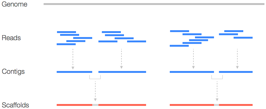
Figure 1: Schematic representation of sequence information. Reads that have a partial or complete overlap with another read makes a contig. A contig, a collection of overlapping reads, starts at the lowest base pair position of said reads and ends at the highest base pair positions of said reads. If a single contig does not cover all the reads than there is a need for scaffolds. Adapted from https://www.biostars.org/p/253222/.
When comparing genome architectures one of the genomes is selected as a reference genome. Marschall et al. describes that a reference genome can be built up in multiple ways: (1) Getting the genome of one single individual as a reference; (2) a consensus genome of an entire population; (3) use the functional elements of a genome (with mutations); and (4) aligning all sequences ever detected to analyse jointly, defined as an “maximal genome”. The representation of this “maximal genome” in a “pan-genome” instead of a single reference genome proves to contain a more complete set of functional elements to analyse (Marschall et al., 2018). A pan-genome can be defined as the core genome containing all the genes that are found in all strains and a dispensable, accessory genome containing all the genes that are only found in a sub set of strains (Tettelin et al., 2005). This pan-genome creates a collection of reference genomes to be analysed jointly (Marschall et al., 2018). The storage of these collections of genomic sequences into graph-based data structures has proven to improve the analysis of complex genomic regions like the major histocompatibility complex (Dilthey, Cox, Iqbal, Nelson, & McVean, 2015).
1.1 The benefits of long-read sequencing for comparative genomics
Most Next Generation Sequencing (NGS) methods, often referred to as high-throughput sequencing, e.g. Illumina, produce a great number of short reads (Fierst, 2015). These short reads have a read length between 100 to 500 base pairs (Jünemann et al., 2013). While the accuracy of genotyping is fairly high with these reads in non-repetitive regions, they cannot provide a contiguous de novo assembly. These short reads are not accurate enough to assemble a genome with repetitive sequences or complex structural variation (Jain et al., 2018).
More recently came the technology of long-read sequencing. Single-molecule real-time sequencers from Pacific Biosciences are able to produce reads of over 10 kilo base pairs long (Gordon et al., 2016). These long reads can greatly help with the assembly of a genome. Although it has been reported that these single-molecule real-time sequencers suffer from significantly higher error rates in the reads compared to shorter read sequencers from Illumina. To create an accurate assembly the use of de novo assembly algorithms and accurate short reads mapping is necessary (Chaisson, Wilson, & Eichler, 2015; Fierst, 2015).
An alternative recently developed technology in sequencing is “pore sequencing”, e.g. nanopore sequencing from Oxford Nanopore Technologies. In this electrochemical method, a nanopore detects single-molecules by electrophoretically driving said molecules in solution (Branton et al., 2008). Recent improvements lead to ultra-long-reads vastly helping in the assembly of complete genomes (Jain et al., 2018). By only using a single sequencing technology (Loman, Quick, & Simpson, 2015), Jain et al. has been able to produce at 30× coverage an human genome assembly with accuracy to 99.44%. Because of this the reconstruction of genomes containing complex structural variation is highly improved, facilitating the comparison of genomic architectures (Jain et al., 2018). Long reads provide a substantial improvement when compared to short reads in assembly contiguity, creating a more accurate assembly.
1.2 The use of gene graphs for comparative genomics
A gene graph can be defined as a graph-based data structure that describes the order of genes in a genome. The gene graph is an ordered pair G = (V,E) with the vertex set V representing the genes and the edge set E representing the order of which genes follow each other. Similar to the definition of a computational pan-genome, a gene graph comparing multiple genome architectures also represents a collection of genomic sequences to be analysed (Marschall et al., 2018). The goal of a gene graph is to reduce the reference bias for a more accurate analysis of genome comparisons.
The construction of gene graphs can be done from whole-genome alignments by detecting the relationship in homology between genome sequences. An example of a tool that tackles this graph construction problem is Ptolemy (Salazar & Abeel, 2018). This tool is able to compare genome architectures of multiple microbial assemblies without the need of a reference genome. Ptolemy can be used to study structural variation and pan-genomes from a ‘top-down’ approach, it uses gene annotations instead of DNA sequences (Salazar & Abeel, 2018).
Contrary to this is the ‘bottom-up’ approach that compares genome architectures based on alignments (Angiuoli & Salzberg, 2010). An example of this is NovoGraph, which performs a global pairwise alignment of each contig relative to the reference genome. A global multiple sequence alignment follows to embed the homology between contigs and the reference genome. Finally an acyclic graph-based data structure is computed to connect the contigs at homologous-identical positions (Biederstedt, Oliver, Hansen, Jajoo, Dunn, et al., 2018).
Another graph-based tool for genome comparison is the Variation Graph toolkit (Garrison et al., 2018). This tool benefits most for short-read data and in which known variation is assembled into a graph to align the short-reads against (Garrison et al., 2018).
1.3 Visualizing gene graphs
Although tools such as Ptolemy and NovoGraph create the comparison of the genome architectures in a graph-based data structure, they do not provide a visualization. The interpretation of a gene graph purely from a non-visual point of view can be significantly restricted. There is a need for the visualization of these gene graphs to get an overview and understanding of their contents since existing graph toolkits do not support gene graphs based on whole-genome alignments (Biederstedt, Oliver, Hansen, Jajoo, Olson, et al., 2018).
Gephi is an example of a widely used visualization tool for networks and graph-based data structures (et al. M. Bastian, S. Heymann, 2009). However, it’s broad applicability, difficults the understanding of complex biological data sets.
A specific tool created for visualizing de novo assembly graphs is BANDAGE. Here, the vertices of the graph are single assembled contigs. The edges are the connection between these (Wick et al., 2015). Nowadays, BANDAGE is a widely used tool to assess the quality of an assembly that is graph assisted. However, it is not designed to compare genome architectures, as it lacks the ability to represent individual paths, compare multiple genome architectures or analyse pan-genomes.
1.4 Project aim
In this study, we aim to build a tool to study graph-based visualization of genome architectures. This tool aims to show Directed Acyclic Graphs for Genomic Readability (DAGGER). DAGGER was specifically developed for Ptolemy, where vertices represent genes in GFA1-formatted files (Li, 2016). Here, we demonstrate the use of DAGGER by the comparison of three novel coliphages. However, DAGGER struggles with bigger datasets (bigger datasets contain more cycles in a graph causing problems with a Sugiyama layout), as visualization is still troublesome. For that we developed Ptolemy Output Enhancement Tool (POET). This standalone tool was intended to datamine Ptolemy, to improve performance of DAGGER. For this, we have used a chimeric phage dataset (long read data) resulting from evolutionary experiments with Escherichia Coli BL21(DE3).
2 Methods
2.1 Development of DAGGER
This tool is written in Java 8 with help of the JavaFX GUI toolkit, and uses the Java Universal Network/Graph framework (JUNG) for the in-memory storage and layout of graphs. JUNG was chosen to separate the Application Programming Interface between the layout and visualization algorithms, which allowed full customization when drawing with JavaFX. The use of the GUI toolkit JavaFX instead of Swing in DAGGER was chosen based on the recommendation from Oracle to migrate Java Applets to Java Web Start and JNLP (docs.oracle.com, 2018). JavaFX provides the ability to write the structure of the graphical user interface separate from the logic of the application in FXML, an XML-based language. In DAGGER the visualization of graphs is drawn with primitives on the graphical context of a canvas instead of shapes on a pane to provide better performance when looking at graphs with many edges and/or vertices.
DAGGER takes as input a GFA1-formatted file (Li, 2016) in which the gene graph is build up from all the lines in the file that describe a path of vertices (Figure 2). The edges and vertices of all paths are added to a graph implementation of JUNG for in-memory storage and layout algorithms.
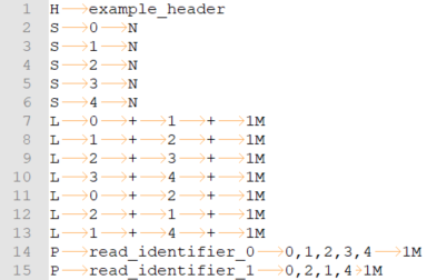
Figure 2: An example of a minimal GFA1-formatted file. Fields of lines are separated by tabular characters and can be seen as light orange arrows. The first line starts with the character “H” and describes the header of a GFA1 file. Vertices are represented in lines with the tag “S” for segment. In such a line the “S” character is followed by a unique identifier and an optional nucleotide sequence (an “N” can be placed to signify no available DNA sequence). Lines starting with “L” are Links and represent edges. A Link line contains the identifier of the outgoing segment followed by its orientation and the identifier for the incoming segment again followed by its orientation. The last field of these lines is an optional CIGAR string to describe the overlap between the vertices (Li et al., 2009). The paths are described by lines starting with a “P”. In this line a unique path identifier has to be given with a comma-separated list of segment identifiers. An optional list of CIGAR strings can be provided to describe the individual segments.
2.1.1 Sugiyama Layout
The first of the two layout options in DAGGER is the Sugiyama layout, a hierarchical layered layout in which all edges traverse from the left to the right based on the methods developed by Sugiyama et al. (1981). The Sugiyama method of laying out graphs has five principles for making a layout of a multilevel digraph readable: (1) The layout should be hierarchical, with each edge pointing in the same direction. (2) There should be as few as possible edge crossings. (3) The edges connecting vertices should be as straight as possible. (4) The edges connecting vertices should be as short as possible. (5) Vertices should be balanced and evenly distributed to visualize the structural information of diverging and converging paths (Sugiyama, Tagawa, & Toda, 1981). DAGGER uses an implementation of the Sugiyama layout that is compatible with the Java Universal Network/Graph framework. The algorithm can be divided into three main steps: (1) The removal of cycles in the graph-based data structure. Here, a depth-first search is performed, in which a graph is traversed over a branch, visiting vertices and backtracking when it reaches the end of a branch. Visiting the same vertex more than once indicates the presence of a cycle. (2) Layer assignment, in which the vertices are assigned to a level from left to right based on the incoming and outgoing edges of vertices. (3) Reduction of edge crossings, where vertices are moved up or down within a Barycenter level (Sugiyama et al., 1981). This method determines the vertical position of vertices at the same level, by the average vertical position of vertices in their neighbouring levels.
In JavaFX a canvas is fully rendered, causing memory-related issues when a canvas has large dimensions. The implementation of the Sugiyama layout is visualized in a JavaFX ListView of a canvas per cell (Figure 3). The number of cells is first determined as described in Figure 4. A ListView is linked to an ObservableList which allows the canvases to update based on if their cell is visible for the user. The vertices and edges are assigned to canvases based on the coordinates assigned by the Sugiyama layout. Cells which contain canvases that are not in view will not be rendered, reducing memory allocation during visualization.
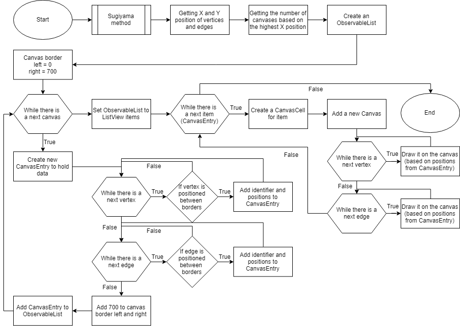
Figure 3: An abstract flowchart of the algorithm to display the Sugiyama layout into a ListView of CanvasCells.

Figure 4: Getting the number of canvases for the ListView to visualize the Sugiyama layout on.
2.1.2 Circular Layout
A circular visualization is achieved onto a JavaFX canvas. The position of vertices and edges are calculated by the CircleLayout algorithm provided with JUNG. Depending on the size of the gene graph, the circular layout can get too large to view in detail when representing the entire figure. To solve this problem, zooming and panning are possible with mouse controls on the canvas on which the circular layout is drawn (Figure 5).
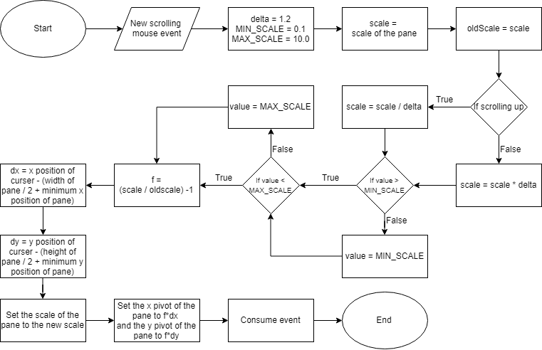
Figure 5: An abstract flowchart of handling zooming and panning of the Circular Layout. The zooming of the visualization is done by setting the scale of the contents of the pane depending on the position of the cursor and a scrolling event. Similarly, the panning of the visualization is handled by getting the start and end position of the cursor after a dragging event.
2.2 Development of POET
To easily extract biological relevant data from big data sets analysed by Ptolemy, a data enhancement tool was created. POET is a standalone application that can be run from the command line or terminal. POET was written in Java 8 without GUI support. POET is designed to analyse read-based gene graphs. This tool takes as input the GFA1-formatted file and a tab-delimited file containing annotation of gene identifiers generated by Ptolemy. The lines within the GFA1-formatted file that describe a path are parsed and added into a list. With this list of all paths containing at least one read, the user can choose to determine the number of unique reads and their frequency. Annotation of genes is based off the annotation file generated by Ptolemy (Salazar & Abeel, 2018). POET can also quantify reads containing interesting gene identifiers based on the users’ input.
2.3 Three novel coliphage dataset
A provided data set of three novel Coliphages, have been used to demonstrate the features of DAGGER. These three novel Coliphages came from a larger dataset of twelve viral samples consisting of ten Escherichia coli BL21 isolates along with a Bacillus subtilis and a Klebsiella pneumonia isolate. The three novel Coliphages have been determined to be most closely related to Escherichia phage vB_EcoM_AYO145A (accession code: NC_028825) with the help of BLAST (Altschul, Gish, Miller, Myers, & Lipman, 1990).
2.4 BL21phi10 chimeric phage dataset
This dataset consists of long-sequencing reads generated by MinION of a chimeric generated virus of bacteria (bacteriophage or in short phage), BL21phi10 with 20423 reads after polishing. In order to study the genome architectures contained in this dataset a gene graph was created. To create this Ptolemy was used on the reads in combination with Escherichia coli BL21(DE3), complete genome (accession code: NC_012892.2). POET was used to get the most common unique paths of this gene graph. Annotations of the prophage region of this genome were re-annotated based on a Enterobacteria phage DE3, complete genome (accession code: EU078592.1) reference, BLASTp (Altschul et al., 1990) and HHphred web server (Zimmermann et al., 2018). POET was used with the gene graph generated by Ptolemy (Salazar & Abeel, 2018) to determine which reads contained at least all essential genes.
This subset of reads that contain all essential genes were further analysed in Geneious Prime version 2019.0.4 (Kearse et al., 2012). In Geneious Prime these reads were manually reversed if needed and zeroed to make alignments for each of these reads against the Enterobacteria phage DE3, complete genome reference. The whole genome alignment algorithm chosen to align these reads to the reference was the progressiveMauve algorithm (Darling, Mau, Blattner, & Perna, 2004). After confirming that all of these reads were in the same order and zeroed properly, they were annotated with the automatic annotation pipeline myRAST (Overbeek et al., 2013).
3 Results
3.1 DAGGER: Visualization of graph-based genome architecture comparisons
Here we present Directed Acyclic Graphs for GEnomic Readability – DAGGER. This tool with a graphical user interface (GUI) can be used for the visualizations of gene graphs. DAGGER was designed with gene graphs that are generated by Ptolemy (Salazar & Abeel, 2018) in mind. The GUI of DAGGER contains three main regions (Figure 6). In the options menu region, the user can load a gene graph with, optionally, an annotation file to visualize (Figure 7). From this file DAGGER takes all the paths of vertices and combines them into one labelled directed ordered multigraph, also referred to as a multilevel digraph, or simply a hierarchy. This gene graph can be visualized in two different layouts: (1) A Sugiyama layout, a hierarchical layered layout in which all edges traverse from the left to the right (Sugiyama et al., 1981). (2) A circular layout in which edges traverse clockwise around the circle except for when there is an alternative sub-path in a region of common vertices between multiple paths.

Figure 6: The Graphical User Interface of DAGGER. The GUI of DAGGER can be split into three main regions: (1) The options menu region contains all the options for graphs. The options are divided into submenus categorized on functionality. (2) The view is where the graph is visualized. This region is interactive and depending on the layout offers various controls. (3) The info panel shows information about a vertex after user interaction in the view.
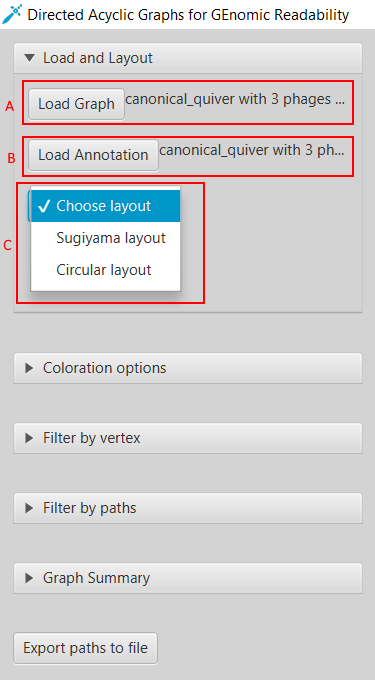
Figure 7: Loading a gene graph with annotation and choosing a layout. (A) DAGGER accepts a gene graph as a GFA1-formatted file (Li, 2016) created by Ptolemy (Salazar & Abeel, 2018). (B) The user can choose to load a directory with annotation files and FASTA files created by Ptolemy. (C) To visualize a gene graph the user has to select either the Sugiyama layout or Circular layout.
In the implementation of the Sugiyama method a user can get a “local” overview of the graph to easily see the branching and joining of paths (Figure 8). To get an overview of which paths contain which vertices the user can select the option to highlight one or multiple paths. Paths that are close to each other and are overlaid on top of the same vertices share those vertices. Vertices and edges can be coloured by their depth (Figure 9). The depth is the number of traversing paths over a certain edge or vertex, which can also be called the coverage. The user can also choose to colour the edges based on which paths traverse them, with each path represented by a unique colour that the user is able to edit (Figure 10).
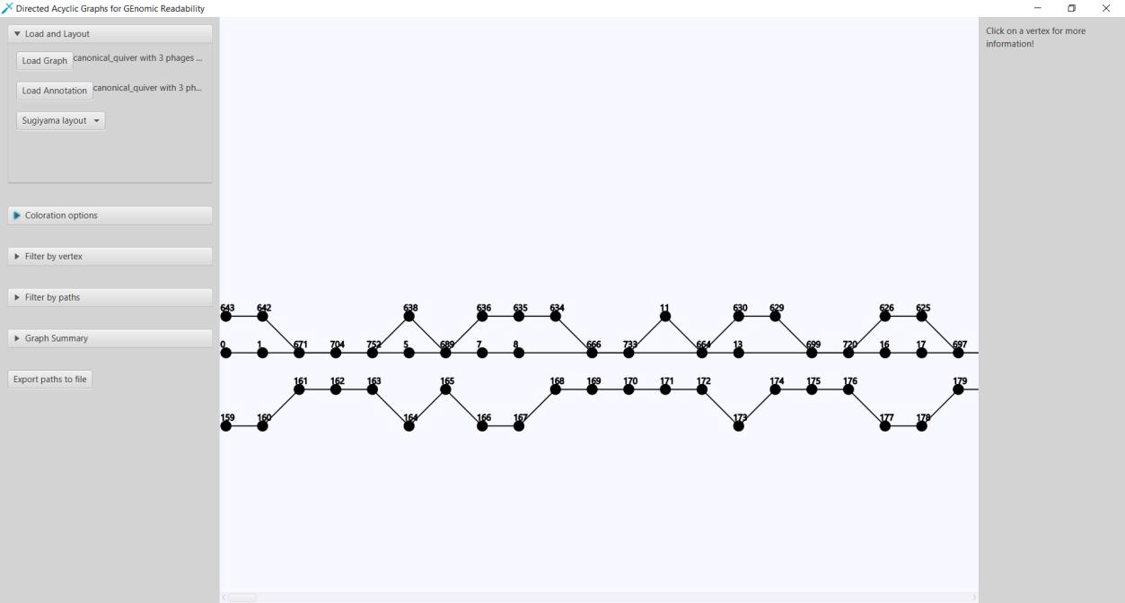
Figure 8: a Sugiyama layout of three coliphages visualized in DAGGER.

Figure 9: A region of a gene graph of three coliphages coloured by coverage/depth, visualized in DAGGER with the Sugiyama layout. (A) Vertices are drawn as circles representing genes with a gene identifier assigned by Ptolemy on top. The edges are drawn as lines between the circles. The coverage/depth can be described as the number of paths traversing an edge or vertex. The coloration scales from black to red with black being the lowest coverage/depth and red the highest. In this example the vertices and edges coloured in black have a coverage/depth of one. The vertices and edges with a brighter red colouration have a coverage/depth of two. (B) The options to select to create this coloration.
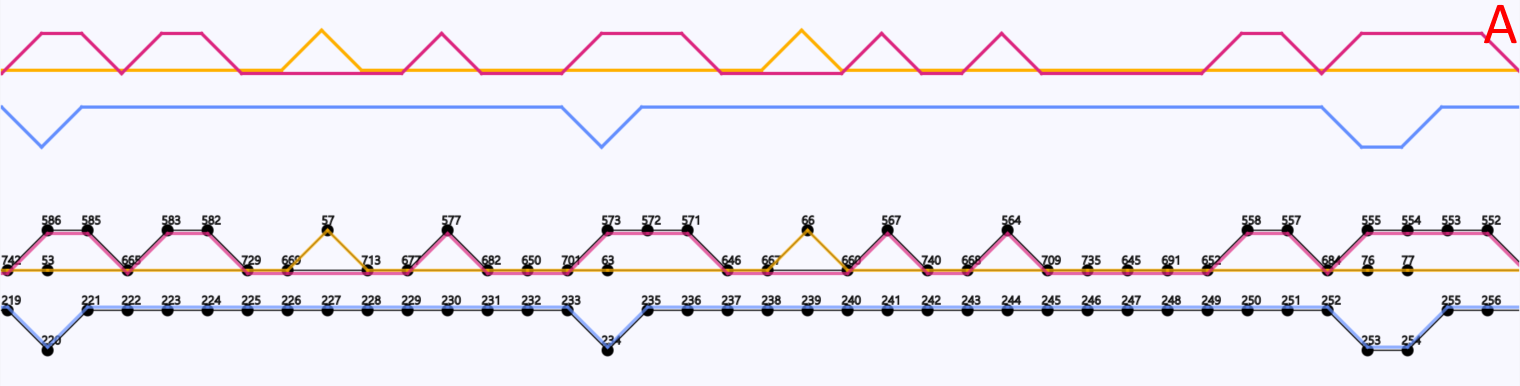
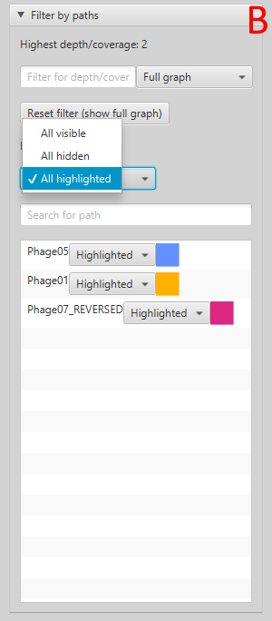
Figure 10: A region of a gene graph of three coli phages, visualized in DAGGER with the Sugiyama layout. (A) Vertices are drawn as circles representing genes with a gene identifier assigned by Ptolemy on top. Edges between the vertices are visualized in colour based on which path the edge belongs to. In this case each path represents an E. coli phage genome. In this region the blue path does not have common vertices with the red and yellow path. The red and yellow paths do have common vertices between them, which are visualized by the edges being close by and laid over those vertices. (B) The options to select to create this highlighting
DAGGER also provides a circular layout to get a more global overview of the entire gene graph. In this layout the vertices and edges are laid out clockwise around the circle until there is an alternative sub-path that is shared in a region of common vertices of multiple paths. In that case an edge could go from a vertex on one side of the circle to another vertex anywhere else in the circle (Figure 11). This circular layout can be zoomed in on areas of the graph. Clicking on one of these vertices and selecting the Sugiyama layout brings that area in view to get a better understanding of what is happening in that region of the graph.
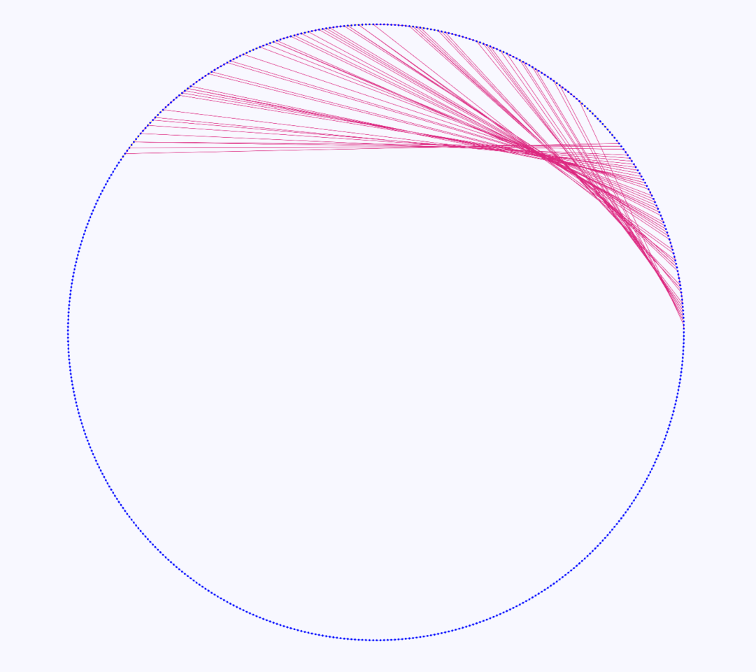
Figure 11: Gene graph of three coliphages visualized in DAGGER with a circular layout. Vertices are drawn as circles representing genes with edges being drawn as coloured lines between the vertices. In this case there are multiple red lines going from one side of the circle to another side of the circle indicating a region of alternative sub-paths within a region of vertices that are common in multiple paths.
In both of these layouts the user can click on any vertex to show more information about a vertex such as outgoing and incoming vertices, traversing paths. Identifiers of the traversing paths can be exported to a text file. This can be used to quickly get identifiers of reads that contain a specific gene. Switching to the Sugiyama layout brings the user a local overview around the clicked vertex. Based on if the user has provided an annotation file generated by Ptolemy, a FASTA-format sequence and gene product/description can also be seen when clicking on any vertex. With this annotation information added it is also possible to search for gene identifiers that were assigned by Ptolemy and gene product/descriptions. To search for vertices with the same exact annotation as the query the user can surround the query by double quotes. It is also possible to submit a query with multiple annotations by using either the
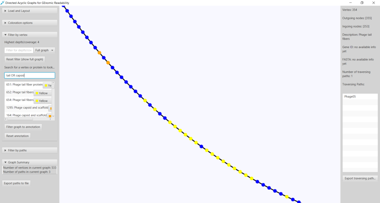
Figure 12: The functionality of DAGGER to highlight vertices based on a query. In this case the search query tail AND capsid returns a list of all gene identifiers given by Ptolemy with an annotation that contains either “tail” or “capsid”. All the query results annotated with tail and capsid are shown in yellow and orange, respectively.
A graph can also be filtered based on how many times a vertex or edge is found in the paths. The user can specify this cut-off N for both vertices and edges to make a subgraph containing vertices and edges that are contained in at least N paths. After filtering it is possible to export this new graph-based data structure as a GFA1-formatted file.
3.2 POET: Long-read gene graph analysis
In this study we also present POET (Ptolemy Output Enhancement Tool). POET is a tool used for getting more data out of Ptolemy (Salazar & Abeel, 2018). POET accepts gene graphs with vertices representing genes in a GFA1-formatted file (Li, 2016). With this GFA1-formatted file provided POET can calculate the frequency of all unique paths of vertices. If these paths represent the gene order of reads this step will give a simplistic overview of gene content of the unique reads with frequency. This data can also be visualized into an image with the paths of vertices with frequency in descending order.
With POET it is also possible to get a list of paths containing duplicate vertices and self-looping edges in which an edge starts and ends at the same vertex. When working with reads as paths this list will show paths containing one or multiple duplications of individual and multiple genes.
It can also be interesting to get statistics of individual genes such as number of genes in reads and frequency of genes overall. The user can also provide a manually curated list of vertex identifiers that represent genes of interest. With this list it is possible to analyse which combinations of these interesting genes show up in reads, which reads contain at least 2 of these interesting genes and finally which reads contain all interesting reads.
The choices that the user can make within POET to perform these tasks is visualized in Figure 13.
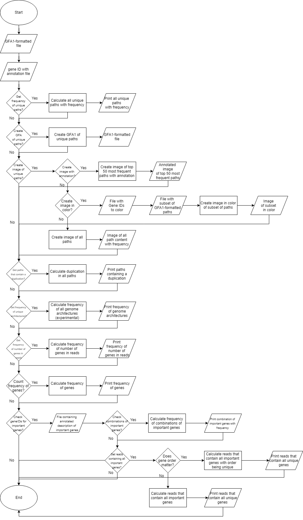
Figure 13: Workflow overview of POET. This workflow shows all the choices the user can make while using POET.
3.3 Analysis of the three novel coliphage dataset
Three Coliphages from the species Escherichia phage vB_EcoM_AYO145A (accession code: NC_028825) have been visualized in DAGGER. The genomes have been given the identifiers 01, 05 and 07 in a previous study. Genomes 01, 05 and 07 contained 159, 317 and 168 genes respectively. The Sugiyama layout showed that there is an overlap of 116 genes between 01 and 07 (Figure 14). The overlap between these two genomes is not constant but equally distributed over their genomes from start to end. The genome 05 does not overlap with the other two genomes.
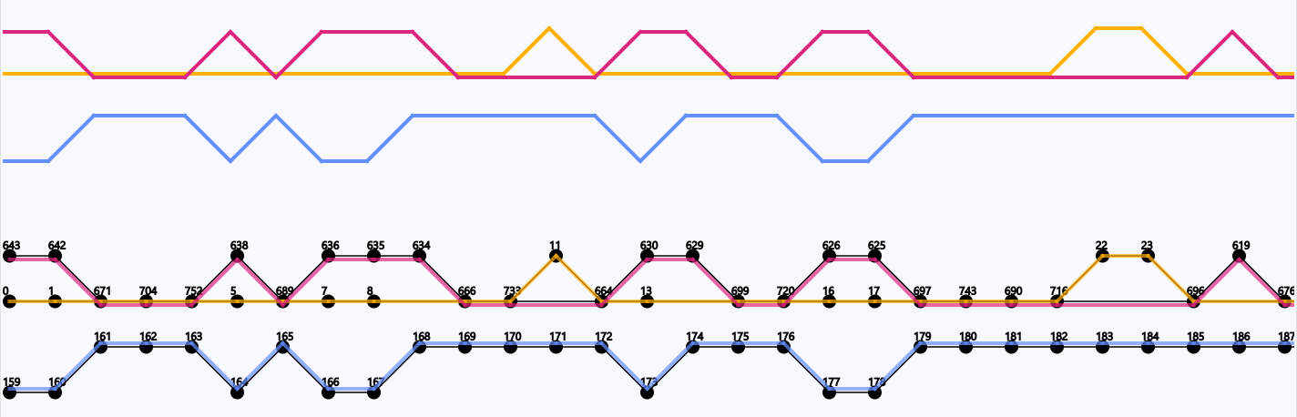
Figure 16: Overlap in genes of the starting region of the three coliphage genomes. Circles represent genes with their gene identifier given by Ptolemy above. A line between two circles signify the order of genes following each other (from left to right). The traversal over the genes of each of the three coliphage genomes is represented by their own colour (red, blue and yellow).
3.4 Analysis of the BL21phi10 chimeric phage dataset
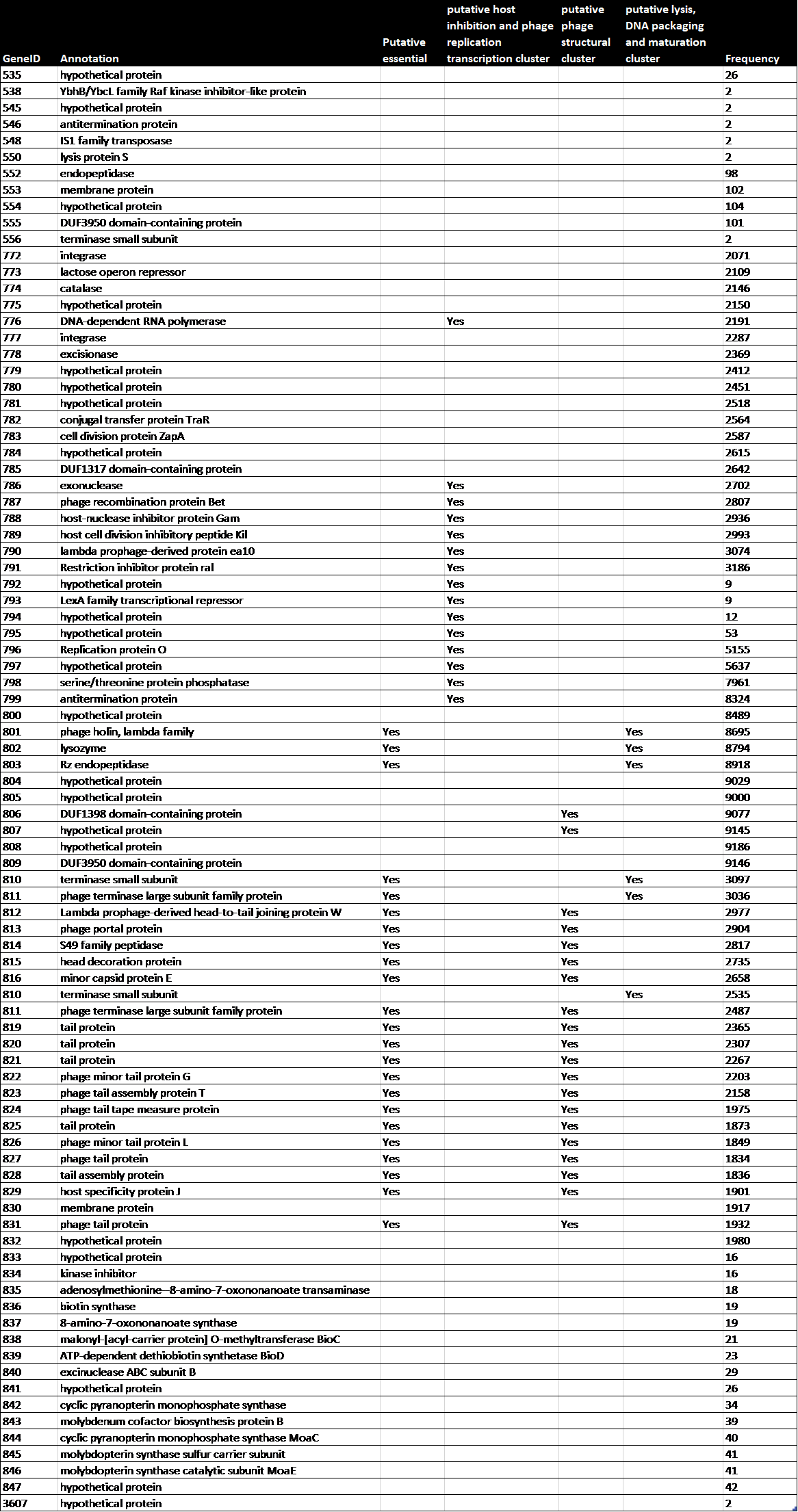
To study the genome architecture of the BL21phi10 chimeric phage dataset a gene graph was created with Ptolemy. The resulting gene graph is represented in a GFA-1 formatted file (Li, 2016) with each of the 20423 reads represented as a path of vertices and edges. All of these 20423 paths combined form a single gene graph. The most frequent unique paths of an average size over 6 kilobase pairs were determined and visualized with POET (Figure 15). This gene graph contained 171 unique genes, the distribution of reads containing a certain number of genes is seen in Figure 16. The frequency of each unique gene in the reads has been plotted (Figure 17). The annotation of genes that show up more than once in the set of 20423 reads has also been plotted (Figure 18). Through manual annotation based on the Enterobacteria phage DE3, complete genome (accession code: EU078592.1) reference it was determined which of these genes that show up more than once are essential for a phage genome to be able to replicate (Table 1). There were twenty-three genes of essentiality found of which five have a role in DNA packaging or maturation cluster and the other eighteen had a role in a phage structural cluster.

Figure 15: The most frequent genome architectures in BL21Phi10 using Ptolemy found by POET. In this figure each arrow represents a gene. Arrows that represent the same gene have the same identifier and colour. The different genome architectures are aligned to the genome architecture of the reference Escherichia coli BL21(DE3), complete genome. (accession number: NC_012892.2). This figure shows only a part, the prophage region, of the larger Escherichia coli BL21(DE3), complete genome. The number of genes outside of this prophage region can be found on the dots on the top left and top right. The relative frequency of how many reads contain a particular genome architecture can be found in blue underlined left of the genome architectures. A difference in gene order compared to the reference is visualized as a square containing the differently ordered genes.
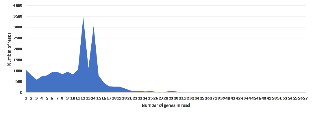
Figure 16: The frequency of number of genes per read of 20423 reads in BL21Phi10.
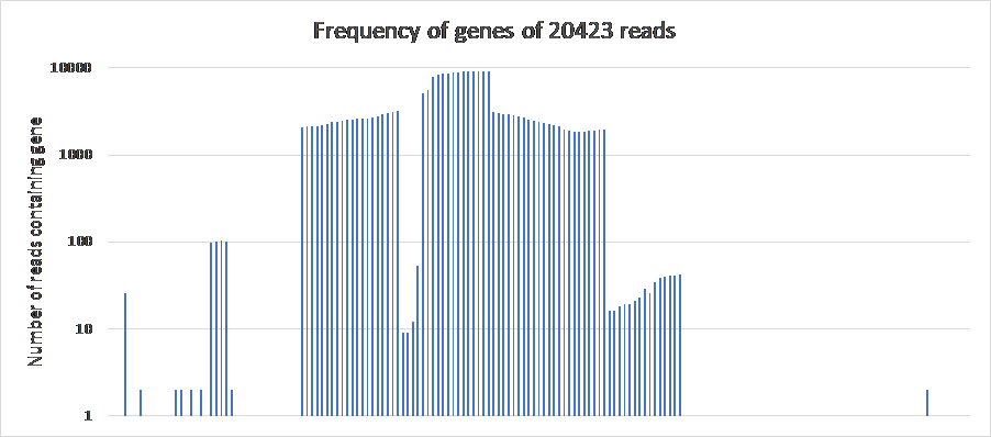
Figure 17: The frequency of genes of 20423 reads in BL21Phi10. The genes are laid out in order of the reference Escherichia coli BL21(DE3), complete genome (accession code: NC_012892.2) over the x-axis. All 171 genes in this plot show up at least once, but the genes which show up once are not represented by a bar because of the logarithmic y-axis.
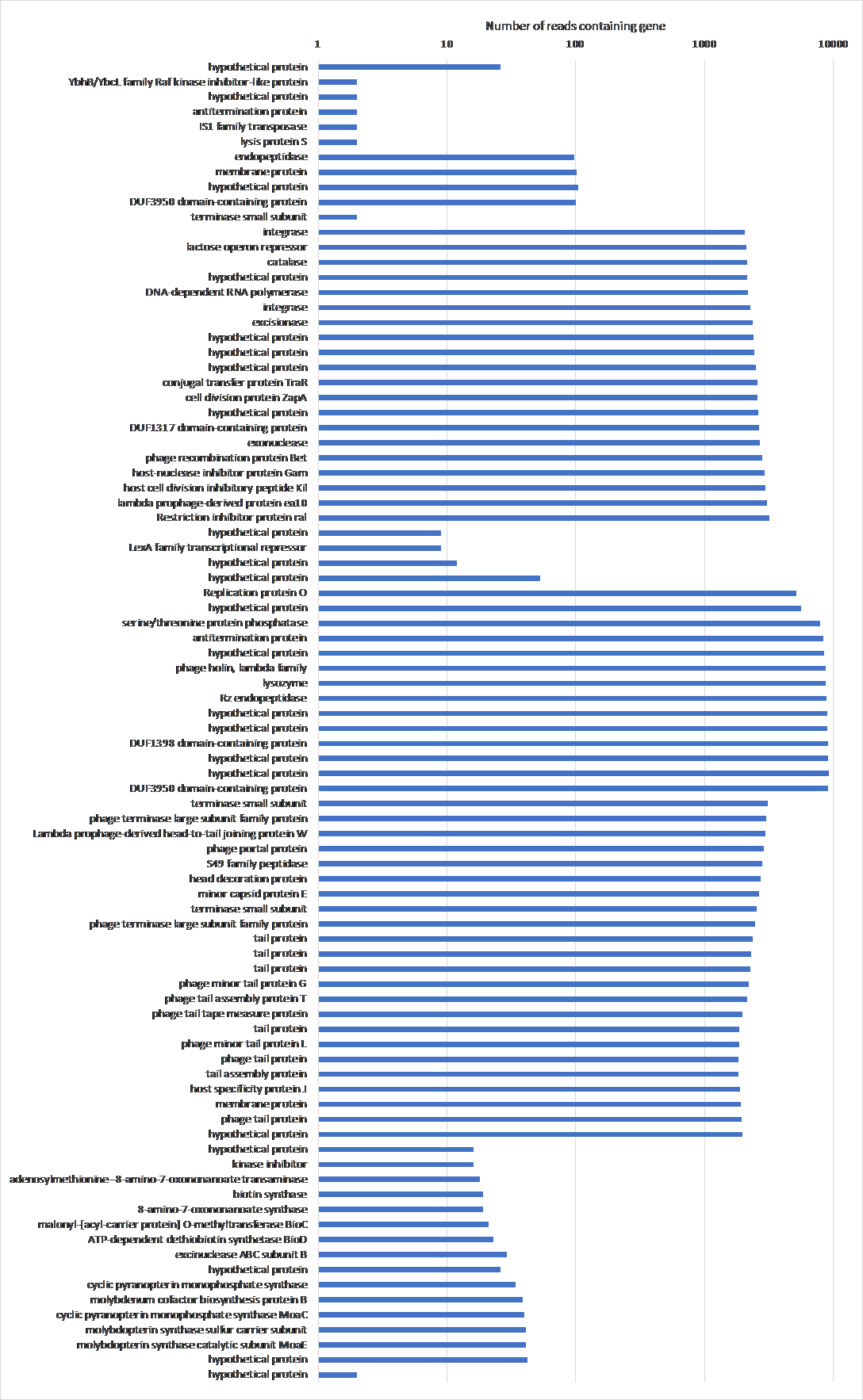
Figure 18: The frequency of genes that show up more than once with their annotations in BL21Phi10. Data from the chimeric phage dataset of 20423 reads. The genes are laid out in order of the reference Escherichia coli BL21(DE3), complete genome (accession code: NC_012892.2) over the y-axis, skipping genes that only show up once in the entire dataset.
Table 1: The annotation, essentiality and role of genes that show up more than once in BL21Phi10.
POET was used to determine the 46 reads which contain at least all essential genes. The size of said reads were compared to the reference Enterobacteria phage DE3, complete genome (Figure 19).
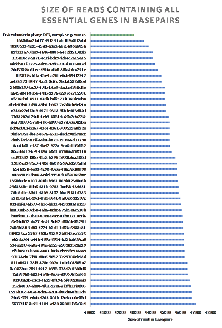
Figure 19: The size of raw reads in BL21Phi10 containing at least all essential genes compared to an Enterobacteria phage DE3, complete genome. 46 of the 20423 reads contain at least all determined essential genes to create a “minimal” phage genome. All 46 of these reads contained a larger sequence than the reference Enterobacteria phage DE3, complete genome (EU078592.1).
4 Discussion
DAGGER was used to visualize gene graphs in which vertices represents genes as created by Ptolemy. BANDAGE was used previously to visualize Ptolemy but would lead to a poorly readable and difficult to interpret layout (Figure 20).
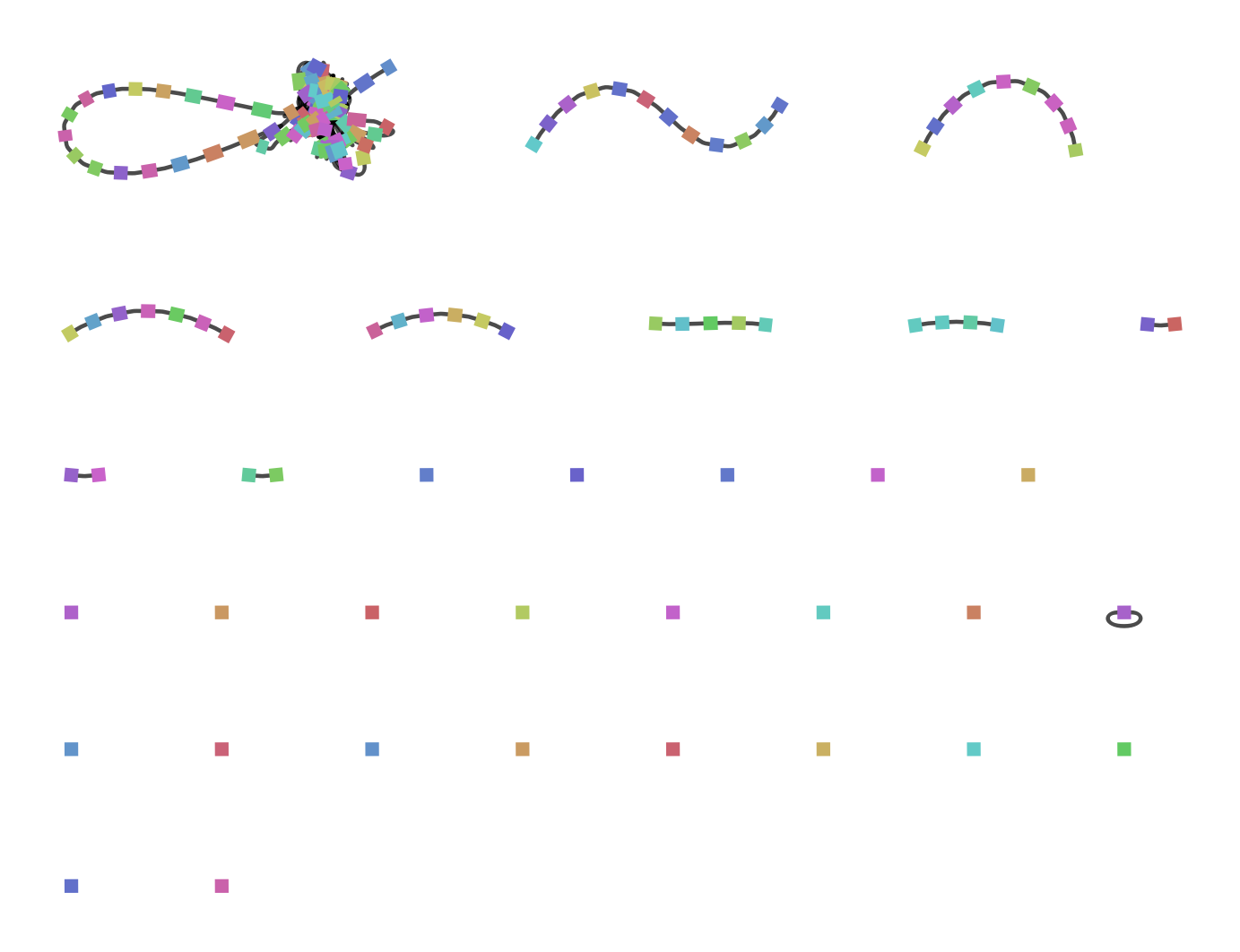
Figure 20: A gene graph of a pool of bacterial and phage DNA generated by Ptolemy and then visualized in BANDAGE. The vertices (squares) represent genes, the edges (black stripes connecting two vertices) represent a connection between two genes. The coloration of the vertices is random and has no biological relevance.
A major disadvantage of DAGGER is the use of directed acyclic graphs. A directed acyclic graph-based data structure has proven to be a not ideal data structure to represent multiple genomes or reads. There are mutations in the genome which can cause a cycle when representing the genome in a graph-based data structure (Figure 21). Gene graphs containing multiple genomes or reads wherein vertices represent genes can contain also contain cycles even when they do not have a duplication themselves, but have an inverse order of genes (Figure 21). The use of a hierarchical (layered) layout such as a Sugiyama layout (Sugiyama et al., 1981) (Figure 8) proved to have some issues in some cases of gene graphs. The construction of these layout algorithms starts with making a given graph-based data structure acyclical. In the case of gene graphs biological information such as the mutations described in Figure 21 could be lost to the user by this strategy.
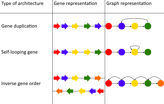
Figure 21: The types of architectures that can cause incompatibility with the Sugiyama layout algorithm. In these three cases shapes with the same coloration represent the same gene. The Sugiyama layout works by making graphs acyclic, which can cause lost biological relevance when using the algorithm with a gene graph. The first case of a cycle in a gene graph is a gene duplication. A gene duplication can cause a cycle in a graph-based data structure when each vertex represents a unique gene. A duplicated gene which follows immediately after the original gene causes a similar problem. In this case the gene graph would contain a self-looping gene/vertex, which also is a circle and not permitted in the Sugiyama layout. If a gene graph consists of multiple paths it can also happen that a path with an inverse gene order is compared to another path in the same graph-based data structure. In this case there are incoming and outgoing edges of all the vertices they share, causing many circles in the gene graph.
The circular layout that is used in DAGGER can give a global overview of the entire gene graph, but it can be confusing to interpret diverging paths since they are not always easily visible. The crossing of edges from one part of the circle to another part of the circle does not necessarily have a biologically relevant meaning.
An alternative strategy for laying out these gene graphs could be using force-directed graph drawing algorithms. Force-directed graph drawings do come with the downside of a high running time and are best suited for graphs with under 500 vertices, but the combination of force-directed graphs with multilevel methods haven proven to be efficient in large graphs (Hachul & Junger, 2005). The genome assembly viewer BANDAGE uses this algorithm (Wick et al., 2015). However, the visualization of gene graphs generated by Ptolemy in BANDAGE still causes many overlapping edges and vertices, making the visualization hard to interpret without a great amount of manual correction. Because of this it could be interesting to build a graph up starting with only the most supported edges, adding the less supported edges manually and as a result create an easier to interpret layout with minimal edge crossings. This strategy is based on the assumption that there is a difference of support in edges between regions within the graph and that an area with the most supported edges would be fairly linear.
From the issues with the Sugiyama layout and circular layout came the need for another way of analysing the gene graphs generated by Ptolemy. POET (Ptolemy Output Enhancement Tool) was created specifically for this task. Some features of POET have however been made unnecessary with the new release of Ptolemy, e.g., the frequency of individual genes in the set of paths is now included in the GFA1-formatted file that Ptolemy produces as output.
POET is able to extract and visualize all unique paths of reads from a Ptolemy generated GFA-1 formatted file. However, this data should not be interpreted as the frequency of all unique genome architectures, since this simply calculates the frequency of unique gene orders in paths from the first gene to last gene. This would mean that a subset within a unique gene order set would not be detected or counted towards that subset of gene order e.g., given these two paths of vertices in order:
Path 1: 0,1,2,3,4,5
Path 2: 1,2,3,4,5,6
In this case these two paths would both be counted as unique. Although they have a subset (of 1,2,3,4,5) that is overlapping, this subset is not detected as a genome architecture that occurs twice by POET.
The most frequently found genome architectures in the case of the BL21phi10 dataset (Figure 15) looks to have three majorly different groups of genome architectures. These genome architectures are however only the most frequently found exact gene order with a cut-off of over 6 kilobase pairs long and it cannot be fully established that this represents the entire dataset. It would be interesting for a further study to compare the overlap of all unique paths and base the groups of unique genome architectures on the differently located overlapping regions within the gene order.
The frequency of genes in the 20423 reads of the BL21phi10 dataset (Figure 17) indicates that the entire gene set of the E. coli bacteria is present (counted at least once) with the prophage region showing up far more. This is expected as the dataset consist mainly of phage DNA that was released through lysis.
The whole genome alignment of the forty-six annotated reads containing at least all essential genes had very poor result. Of these forty-six reads, the progressiveMauve algorithm was able to only get a consensus of twelve base pairs between two reads.
5 Conclusion
Comparing genome architectures with a gene graph can be useful, but the best way to visualize the resulting gene graph is not trivial.
The assumption that a gene graph is acyclical is false. The use of an implementation of the Sugiyama (Sugiyama et al., 1981) method for laying out gene graphs in which vertices represent genes leaves out valuable biological information. There are very common cases in which mutations on gene level can cause a gene graph to contain circles which is not compatible with a Sugiyama layout. The single gene graph consists of multiple genomes when comparing genome architectures. The result can also cause cycles between those paths, without the paths themselves containing any cycles.
The implementation of this circular layout used in this study can give an overview of an entire gene graph, but lacks the ability to easily interpret the non-linear regions of such a gene graph.
Force-directed graph drawing of gene graphs generally suffers from too much edge crossings. Building a graph up from most to least supported edges could lead to less edge crossings and a better interpretation in a force-directed graph, although this strategy assumes that there is a variety of support within the gene graph.
When analysing unique genome architectures from a gene graph one should also look at the subsets that are contained in the individual paths. A partial overlap between paths should also be interpreted as a shared genome architecture. Simply determining the frequency of unique gene ordering based on the exact path does not outright prove the groups of unique genome architectures.
Acknowledgements
I want to thank Stan for allowing me to do my bachelor internship in his lab.
I am grateful to Thomas for making me more critical in asking myself what I do and do not know.
Thanks to Alex for learning me to communicate more clearly in non-technical terms.
I am also incredibly grateful for Franklin who helped me become a better researcher, and a more biological-aware computist. Although this project had it’s ups and downs I not only learned a lot but also grew as a person thanks to you.
References
Altschul, S. F., Gish, W., Miller, W., Myers, E. W., & Lipman, D. J. (1990). Basic local alignment search tool. Journal of Molecular Biology, 215(3), 403–410.
Angiuoli, S. V, & Salzberg, S. L. (2010). Mugsy: fast multiple alignment of closely related whole genomes. Bioinformatics, 27(3), 334–342.
Biederstedt, E., Oliver, J. C., Hansen, N. F., Jajoo, A., Dunn, N., Olson, A., … Dilthey, A. T. (2018). NovoGraph: Genome graph construction from multiple long-read de novo assemblies. F1000Research, 7(0), 1391. https://doi.org/10.12688/f1000research.15895.1
Biederstedt, E., Oliver, J. C., Hansen, N. F., Jajoo, A., Olson, A., Busby, B., & Dilthey, A. T. (2018). NovoGraph : Human genome graph construction from multiple long-read de novo assemblies [ version 2 ; referees : 2 approved ] A genome graph representation of seven ethnically diverse whole human genomes Referee Status :
Branton, D., Deamer, D. W., Marziali, A., Bayley, H., Benner, S. A., Butler, T., … Schloss, J. A. (2008). The potential and challenges of nanopore sequencing. Nature Biotechnology, 26(10), 1146–1153. https://doi.org/10.1038/nbt.1495
Chaisson, M. J. P., Wilson, R. K., & Eichler, E. E. (2015). Genetic variation and the de novo assembly of human genomes. Nature Reviews Genetics, 16, 627. Retrieved from https://doi.org/10.1038/nrg3933
Darling, A. C. E., Mau, B., Blattner, F. R., & Perna, N. T. (2004). Mauve: multiple alignment of conserved genomic sequence with rearrangements. Genome Research, 14(7), 1394–1403.
Dilthey, A., Cox, C., Iqbal, Z., Nelson, M. R., & McVean, G. (2015). Improved genome inference in the MHC using a population reference graph. Nature Genetics, 47, 682. Retrieved from https://doi.org/10.1038/ng.3257
et al. M. Bastian, S. Heymann, M. J. (2009). Gephi: an open source software for exploring and manipulating networks. Proceedings of International AAAI Conference on Web and Social Media, 3, 361–362. Retrieved from http://bit.ly/1SVVbop
Fiers, W., Contreras, R., Duerinck, F., Haegeman, G., Iserentant, D., Merregaert, J., … Ysebaert, M. (1976). Complete nucleotide sequence of bacteriophage MS2 RNA: primary and secondary structure of the replicase gene. Nature, 260, 500. Retrieved from https://doi.org/10.1038/260500a0
Fierst, J. L. (2015). Using linkage maps to correct and scaffold de novo genome assemblies: Methods, challenges, and computational tools. Frontiers in Genetics, 6(JUN), 1–8. https://doi.org/10.3389/fgene.2015.00220
Fleischmann, R. D., Adams, M. D., White, O., Clayton, R. A., Kirkness, E. F., Kerlavage, A. R., … Merrick, J. M. (1995). Whole-genome random sequencing and assembly of Haemophilus influenzae Rd. Science, 269(5223), 496–512.
Fraser, C. M., Gocayne, J. D., White, O., Adams, M. D., Clayton, R. A., Fleischmann, R. D., … Kelley, J. M. (1995). The minimal gene complement of Mycoplasma genitalium. Science, 270(5235), 397–404.
Garrison, E., Sirén, J., Novak, A. M., Hickey, G., Eizenga, J. M., Dawson, E. T., … Durbin, R. (2018). Variation graph toolkit improves read mapping by representing genetic variation in the reference. Nature Biotechnology, 36, 875. Retrieved from https://doi.org/10.1038/nbt.4227
Gordon, D., Huddleston, J., Chaisson, M. J. P., Hill, C. M., Kronenberg, Z. N., Munson, K. M., … Eichler, E. E. (2016). Long-read sequence assembly of the gorilla genome. Science, 352(6281), aae0344. https://doi.org/10.1126/science.aae0344
Hachul, S., & Junger, M. (2005). Large-Graph Layout with the Fast Multipole Multilevel Method. ACM Transactions on Graphics, V(December), 1–27. https://doi.org/10.7155/jgaa.00150
Jain, M., Koren, S., Miga, K. H., Quick, J., Rand, A. C., Sasani, T. A., … Loose, M. (2018). Nanopore sequencing and assembly of a human genome with ultra-long reads. Nature Biotechnology, 36, 338. Retrieved from https://doi.org/10.1038/nbt.4060
Jünemann, S., Sedlazeck, F. J., Prior, K., Albersmeier, A., John, U., Kalinowski, J., … Harmsen, D. (2013). Updating benchtop sequencing performance comparison. Nature Biotechnology, 31, 294. Retrieved from https://doi.org/10.1038/nbt.2522
Kearse, M., Moir, R., Wilson, A., Stones-Havas, S., Cheung, M., Sturrock, S., … Duran, C. (2012). Geneious Basic: an integrated and extendable desktop software platform for the organization and analysis of sequence data. Bioinformatics, 28(12), 1647–1649.
Koonin, E. V. (2009). Evolution of genome architecture. International Journal of Biochemistry and Cell Biology, 41(2), 298–306. https://doi.org/10.1016/j.biocel.2008.09.015
Koonin, E. V, & Galperin, M. (2013). Sequence—evolution—function: computational approaches in comparative genomics. Springer Science & Business Media.
Li, H. (2016). Minimap and miniasm: fast mapping and de novo assembly for noisy long sequences. Bioinformatics, 32(14), 2103–2110. Retrieved from http://dx.doi.org/10.1093/bioinformatics/btw152
Li, H., Handsaker, B., Wysoker, A., Fennell, T., Ruan, J., Homer, N., … Durbin, R. (2009). The sequence alignment/map format and SAMtools. Bioinformatics, 25(16), 2078–2079.
Loman, N. J., Quick, J., & Simpson, J. T. (2015). A complete bacterial genome assembled de novo using only nanopore sequencing data. Nature Methods, 12, 733. Retrieved from https://doi.org/10.1038/nmeth.3444
Marschall, T., Marz, M., Abeel, T., Dijkstra, L., Dutilh, B. E., Ghaffaari, A., … Schönhuth, A. (2018). Computational pan-genomics: Status, promises and challenges. Briefings in Bioinformatics, 19(1), 118–135. https://doi.org/10.1093/bib/bbw089
Overbeek, R., Olson, R., Pusch, G. D., Olsen, G. J., Davis, J. J., Disz, T., … Shukla, M. (2013). The SEED and the Rapid Annotation of microbial genomes using Subsystems Technology (RAST). Nucleic Acids Research, 42(D1), D206–D214.
Salazar, A. N., & Abeel, T. (2018). Approximate, simultaneous comparison of microbial genome architectures via syntenic anchoring of quiver representations. Bioinformatics, 34(17), i732–i742. https://doi.org/10.1093/bioinformatics/bty614
Sugiyama, K., Tagawa, S., & Toda, M. (1981). Methods for visual understanding of hierarchical system structures. IEEE Transactions on Systems, Man, and Cybernetics, 11(2), 109–125.
Tettelin, H., Masignani, V., Cieslewicz, M. J., Donati, C., Medini, D., Ward, N. L., … Fraser, C. M. (2005). Genome analysis of multiple pathogenic isolates of <em>Streptococcus agalactiae</em>: Implications for the microbial “pan-genome.” Proceedings of the National Academy of Sciences of the United States of America, 102(39), 13950 LP-13955. https://doi.org/10.1073/pnas.0506758102
Waterston, R. H., Lander, E. S., & Sulston, J. E. (2002). On the sequencing of the human genome. Proceedings of the National Academy of Sciences, 99(6), 3712 LP-3716. https://doi.org/10.1073/pnas.042692499
Wick, R. R., Schultz, M. B., Zobel, J., & Holt, K. E. (2015). Bandage: Interactive visualization of de novo genome assemblies. Bioinformatics, 31(20), 3350–3352. https://doi.org/10.1093/bioinformatics/btv383
Zimmermann, L., Stephens, A., Nam, S.-Z., Rau, D., Kübler, J., Lozajic, M., … Alva, V. (2018). A completely Reimplemented MPI bioinformatics toolkit with a new HHpred server at its Core. Journal of Molecular Biology, 430(15), 2237–2243.